

Project Wharfair – The Logo
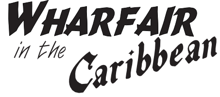
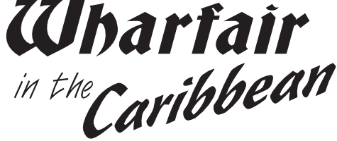
I needed some rest from my vector illustrations – so I had a look at my loose ends. One of them was to design a logo for Projekt Wharfair. And I was immediately hooked. I’ve now settled on four variants for ‘Wharfair’.
That gave me the idea of asking you, the readers of Nauticalfiction.net, which of these variants you like best.
As you can see, I’ve also played around with a few versions for ‘Caribbean’, but that’ll be the subject of another poll – ultimately, the typeface needs to match the final font for ‘Wharfair’.
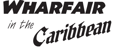
Variation 1
Variation 2
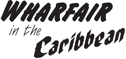
Variation 3
Variation 4
Loading …
Leave a Reply